
Web Apps: Why Offering A Low Contrast Mode Makes You More Accessible, Not Less
The current high contrast standard actively locks out users from accessing your web apps

I had my first migraine episode when I was 14. I have never experienced such a pain before in my life. My first migraine aura happened with 24. I couldn't see anything clear for a day. Two years later I lost the ability to speak for the first time. I could not even develop a clear thought for hours. Words and sentences didn't make sense any more. It was scary. It happened twice since. Both times triggered by a combination of stress and light / screen work.
43% of women and 18% of men will experience migraines at least once in their life. Some of them will suffer from migraines for the rest of their lives, trying to avoid triggers as much as possible.
Photosensitivity / Photophobia
As a woman suffering from migraines and photosensitivity I am stuck in a loop of avoiding light and flicker effects because they can trigger a migraine episode. But I am also not able to be close to light when experiencing an episode because it influences the severity of the pain and symptoms. Websites are probably the last connection that would be made to this condition, so how does web design come into the place here? I can give you an example:
When I joined Hashnode to publish my articles here, I had the problem that the dark mode editor had such a high contrast, that I could not write my articles in the editor itself. Looking onto the screen would make my vision blurry and my thoughts would feel like being wrapped in cotton wool. I would get nauseous and light-headed.
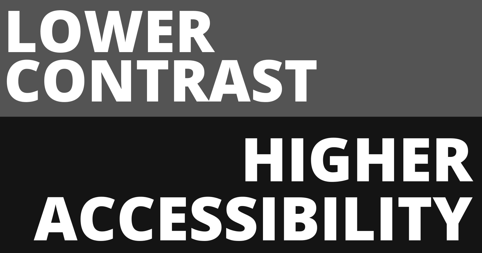
How it looks
My brain processes the high contrast similar to how it would process me looking into the sun or looking into a lamp for a long period of time. Everyone who did this before knows that you will have blind spots in your vision for a while. The exact same thing happens to me looking at a high contrast page. As a reminder how the old dark mode on Hashnode looked:
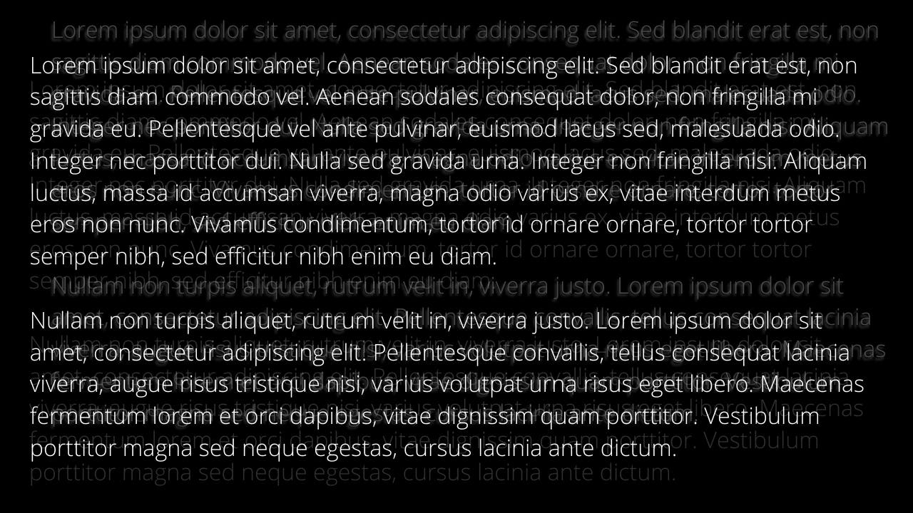
A very bright font on a very dark background. The text would imprint into my vision and as soon as I continued to read further, the imprinted text and the actual text would shift into a wild mixture of letters.
Since it's hard to explain, I will show this picture that kind of resembles, how I see and read high contrast websites. It is energy draining to focus on the text, to see typos and to put thoughts into words. But it is also a trigger for migraine auras and migraine seizures for me.
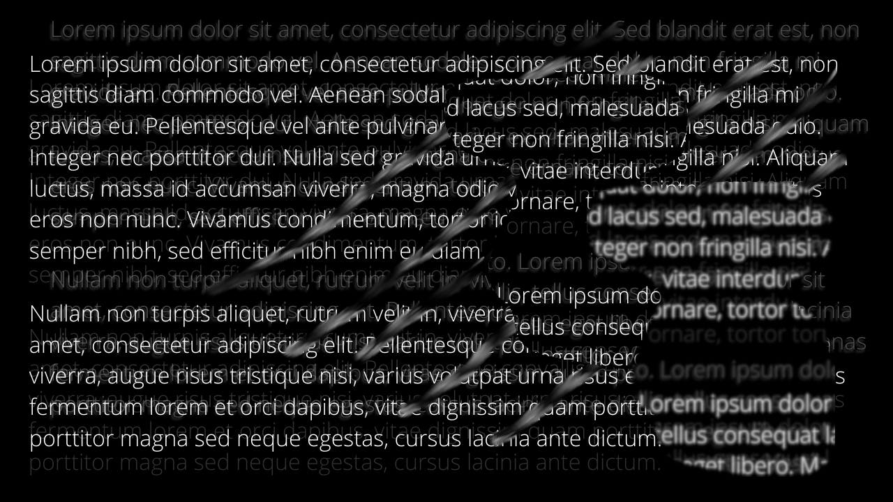
When this trigger turns into a migraine aura, the picture will develop further and look like this. The patches on the right will be uncontrollably floating through the right side of my vision and will even persist when I close my eyes:
At this point I will HAVE to leave the PC. Darken the room completely. Get a cold wet towel to put it on my forehead and face and I will be out for 2-3 hours. Once the aura disappears I will be left with a feeling like a hangover and terrible nausea.
Talking to companies
Back then I tweeted to Hashnode the following message:
And I also added a little mock-up I made on how it would be easier to use the dark mode without the strain on the eyes while staring on the text for sometimes hours.
Hashnode listened and improved the dark-mode on the website and the editor, removed the very dark background and replaced it which I am very thankful for.
Today's gold standard of high contrast designs
Today's standards regarding the contrast between text and background have been defined several times and the common understanding is to provide a high enough contrast to cater towards users with visual impairments.
While there are calculations how high the contrast has to be – many designers go for the “the higher, the better” approach ultimately not realizing that their attempt to make their product MORE accessible made it less accessible. The accessibility standards push designers to include one group and exclude another no matter how they decide. But it does not have to be like that.
Misconception of only flickering images being problematic
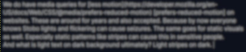
We do have media queries for less motion [prefers-reduced-motion] on websites. These are around for years and also widely accepted. Because by now everyone knows strobe lights and flickering can cause seizures. Not many people know that the same goes for static visuals as well. Especially static patterns like stripes can cause this in sensitive people. And what is light text on dark background ultimately? Light stripes on dark.
This is the upper paragraph when reducing the sharpness.
The Epilepsy Research UK published the following findings about triggers in static imagery:
The study, led by Dora Hermes, of the University Medical Center (UMC) Utrecht in the Netherlands, and published in the journal Current Biology, has looked into the role of gamma oscillations in the brain. Their review focused on gamma oscillations induced by the spatial features of some static images, such as those depicting black and white bars. The repetitive pattern of brain activity of gamma oscillations takes place when people are exposed to these images. In fact, the authors note that these images can cause headaches and migraines in photosensitive people as well as discomfort in perfectly healthy people.
It is further mentioned how to take the severity out of these triggers:
The likelihood that a [photosensitive seizure] is induced by viewing a grating can be reduced by decreasing the size of the grating [pattern], by reducing the contrast, by superimposing a second grating [pattern] to create a plaid or checkerboard, or by superimposing noise.
Surprisingly, we have a solution for this, because we have a media query for contrast [prefers-contrast] which could be set to “more” and “less” contrast. Unfortunately not all browsers support this media query yet. And even if they do – we need designers and developers that understand the impact they can have on people like me when supporting these.
Right now designers and educators lack the awareness for such a demand. Because even big educational institutes see low contrast web content as “amateurish” and “ignorant”. Basically every accessibility checker will disregard a lower contrast website as inaccessible because it only tests for one use case.
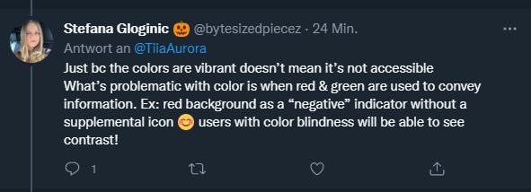
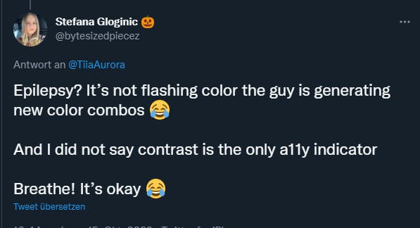
Here you can see how defensive and ignorant even a11y supporters react when pointing out that the measurements that are done today, are not enough. Education and awareness about the different expectations for accessible media needs to become better.
Easy implementation as an additional option
I build a little Svelte kit application this afternoon to show how an easy and quick toggle for high- and low-contrast implementation could be. Just simply build in as an additional option for users until all browsers support the contrast settings. Just as we have light- and dark mode now.
Example page: https://low-contrast-example.netlify.app/
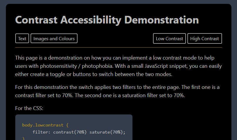
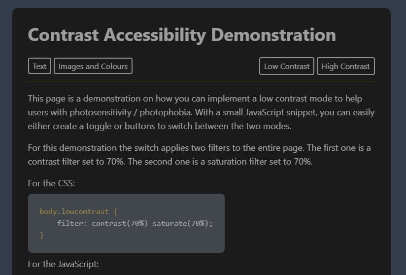
All it requires is a JavaScript toggle to add one CSS-class that adds two filters to the website. The same class can also be used as the media query itself. A further explanation is on the test page. It will also show how this filter can mute colourful images.
Final words – Accessibility is not a boolean
Accessibility can never be 100% accessible for everyone because the demands can be contrary. Accessibility is not a boolean that decides if a project is or is not accessible. But we need to keep a few things in mind when talking about accessibility.
- Listen to affected people. They are your best source for information. Don't disregard your users needs because their needs were not mentioned in your education path.
- If it is a small change that can have a big impact – Do it.
- Understand the limitation of accessibility check tools and guidelines.
- Educate people around you. Only if designers and developers know about issues they can work on them.