Introducing: LeapStone - A Lost Ark Quest Tracker made in Svelte Kit
Around 2 months ago I started playing the MMO Lost Ark in my free time. At first installed out of curiosity, I quickly fell in love with the character creation and story. One thing that usually comes with MMOs is an almost never end list of tasks the developers give you on a regular basis to make sure you keep logging into your account and keep playing.
I am already bad at keeping track of tasks in real life. Let alone in a game. So the idea was born to make a little something something in notion and call it a day. But wait, why doing something in notion when we simply can make a website in Svelte Kit?
About 3 weeks ago the planning with coldino on how to properly set a project like this up, started and since then we have been launching into Beta. I will tell you how we organized the project and which challenges we had to overcome to end with the project we have now.
LINK: https://leapstone.netlify.app/
Svelte Kit, huh?
Yea Svelte Kit has become our favourite framework to work with, because of how quick it is to set up and build with several people on it at the same time. So it was no question to use it again for this project.
Tailwind and Daisy UI
This happened to be the first time I was working with Tailwind and also the first time working with Daisy UI. My opinions about Tailwind are still a bit split. I did learn Vanilla CSS and that's what's imprinted into my brain. Tailwind felt like using inline style, and it just felt wrong to me to the core. But after a while I could see why people like to use it, because it makes layouting pretty quick and changes to one element only change the element and not accidentally many other things in projects.
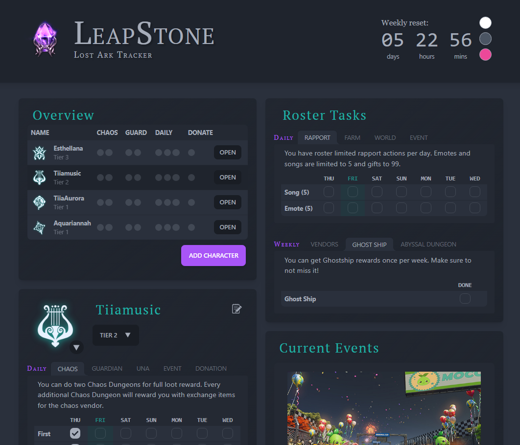
With Daisy UI we got the opportunity to use the predefined Themes as our Light and Dark Mode. Not only that, because Lost Ark being a Korean game, I insisted on adding a cute Pink Mode as well. It fits the overall mood of the game quite well.
We used the predefined Themes from Daisy UI but tweaked them to our liking. Not only that, but we also used the CSS filter "hue-rotate" to change the colour in the graphic in our header to fit in with the changed colour. It can be seen here:

Issues during the project
Since this project heavily relies on data out of the game – data we didn't have – we had to rely on friends and active players to give us their feedback and share their knowledge with you. We also constantly recategorized the tabs and tables to make a logical sense to us.
The worst thing would be that the whole page was so overwhelming that you don't know how to use it. So when you enter the page for the first time, you will not see a lot until you actually enter data.
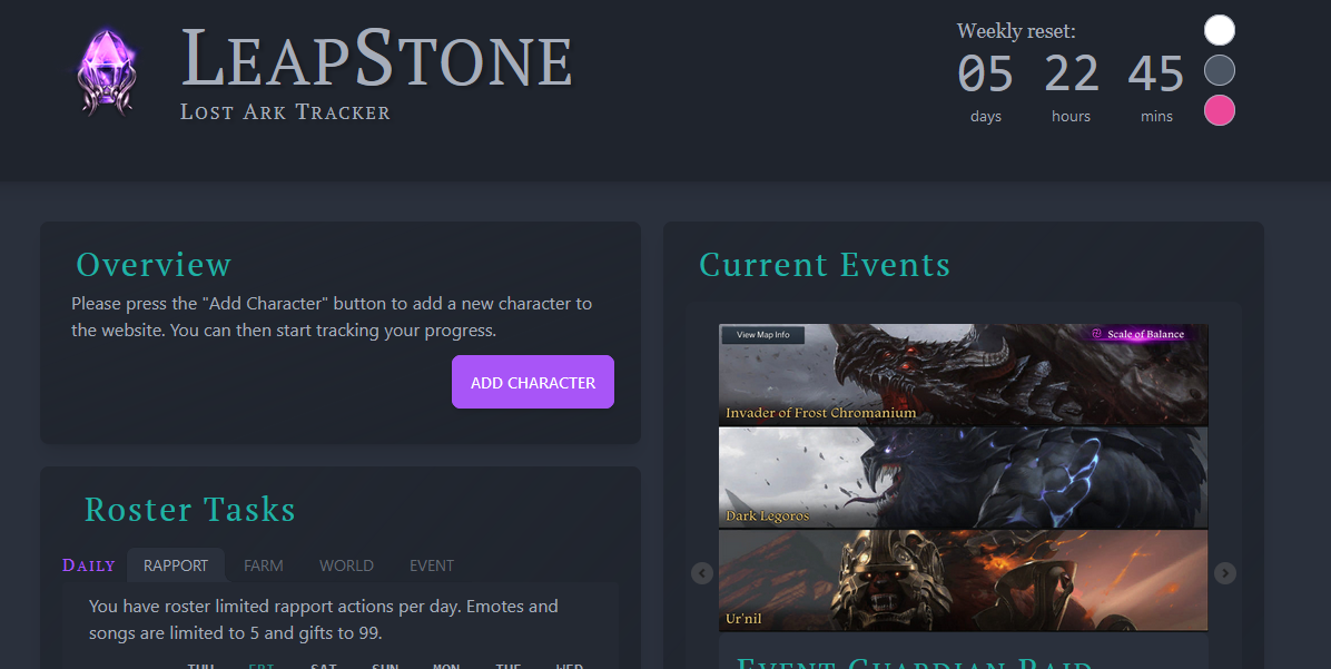
As soon as you enter a character name you will see the relevant data. My idea of making interfaces like this is to hide every data that is not needed for the user and slowly introduce them piece by piece to the whole application. When its the time for it.
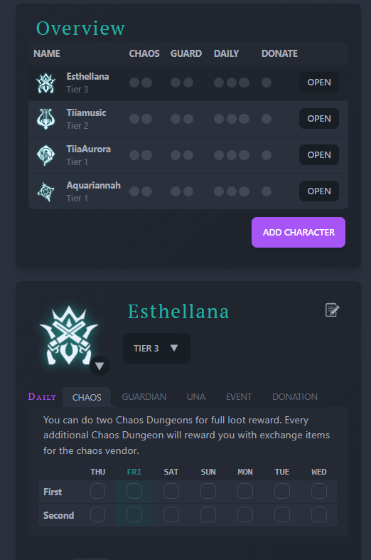
The other problem we ran into is, that there is practically no API to the game we could use. That is somewhat heartbreaking because that way we could pull certain data directly into the application and reduce the manual work the user has to do. Many games offer these APIs but not all of them and in this case the game is still very new. As soon as we do get access to an API, we will try to implement it that way.
User feedback
The user feedback was very constructive and supportive. We got many amazing suggestions towards future features and changes to existing features. Having a dedicated community of gamers and giving them the opportunity to help shape a tool that is dedicated to them is the kind of community empowerment that I always loved about small development projects.
Plans
We have a lot more plans and our To-Do list doesn't shrink the further we go, but this project has been a positive learning experience for me on how to work on a product that will be used by potentially a lot of people.


